The purpose of any flyer is to attract attention to an event, product or offer and illicit a positive response. This may be a purchase, a lead, a visit to a website or a venue. As with all forms of visual marketing, the key elements are the same; attract attention, create interest and desire and encourage the individual to take a specific action.
In terms of design, ideally the individual elements of imagery, typography and text content, work in synergy to create an aesthetically appealing document which delivers the desired outcome. However, the reality is that this is often easier said than done, which is why we have put together this informative article to help you, the reader, create stunning flyers. We sincerely hope it adds value and, as always, if you need a hand, let us know. Let’s dive in…
The first step is to ascertain an overall strategy by asking yourself:
What are the Aims of the Flyer?
Are you looking to generate sales, leads or visitors? Each of these aims will have varying success rates. Generating sales from a flyer can be more difficult than attracting visitors; be aware of this when analysing the campaign.
What Size is the Flyer and what Volume Required?
Flyers can be any size you desire, within reason; typically A5 (148 x 210mm). Ultimately, it needs to be a manageable size which is large enough to get your message across effectively. Volume will depend on your aims and your budget. In terms of printing runs, a short run is up to approximately 500 flyers, which will usually be printed digitally; longer runs may be litho printed. If you have any questions regarding printing, please ask.
What is the Flyer Promoting?
This question will define in many ways the styling of the flyer. Events are often time limited and the purported shelf life of a flyer tends to be relatively short; whilst offers and general information can be extensive in terms of time frames.
What is the Budget for the Flyer?
Take into account the cost of printing and the method of distribution you intend to use. This will dictate the type of printing and the specification of paper. Will the flyers be handed out, delivered (eg with a local newspaper) or posted through doors?
How will you Measure Effectiveness to Gauge Return on Investment?
It is extremely important to monitor the success of the campaign, by utilising some form of differentiation from your other marketing activities; to enable you or your marketing team to establish the effectiveness of the promotion.
For example you could use:
- Specific promotional code exclusively used on the flyers
- Dedicated contact phone number
- Exclusive website landing page
- Limited targeted geographical regions
Who are the Target Audience?
If you have a clear vision of your ideal client, you can tailor the content and messages of the flyer to that niche or industry. Targeted marketing is inherently more cost effective and yields a higher return on investment than blanket marketing to all. If you are unsure as to the profile of your target client then now is the time to define; the profile will provide essential information for your marketing campaigns.
Are you aiming to appeal to your existing clientele, or entice new potential customers? Do you know the demographics of your ideal client? Are you planning to be industry specific?
Once you have assembled the relevant information from the above, this will provide the basis for the following styling elements of the flyer.
Plan and Organise Content
Your Message
Keep your message and design simple. Don’t confuse matters with too many images and too much text; bullet points can help. Keep your aims and messages at the forefront of your mind.
Effective use of Colour
What colours will you use? Do you have a brand colour scheme? Does your business have a corporate colour scheme?
Colours contribute in defining the mood of the flyer. Bold dark colours communicate energy, confidence and strength; pastel shades can signify softness and an easy going demeanour. Each specific colour has its own symbolic traits; red is perceived as energetic, blue as calming. Use this information to tailor the colours to suit your message. However, keep it simple.
Use of Imagery
Flyers can utilise multiple images within their design, whether as a background or as the key element in the design. The recipe is to make the imagery an integral part of the message and in some cases may be the whole message. An example is an image for any well known fast food restaurant. Imagery utilises their food in the message, it is the element which illicit the desired response for the target audience; to create hunger and desire to eat their product.
The purpose of the imagery selected should be to create the desired emotive response; not just to illustrate the product, service or event. To show what the customer will gain; what it will do for them. Always use high quality images; blurring or pixelation will reduce the images’ effectiveness. What would your perception be of the company giving you such a flyer?
Typography
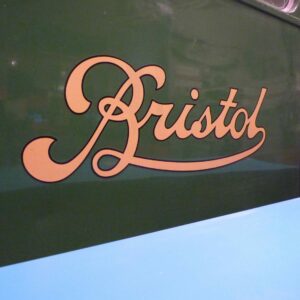
The choice of fonts will impact on the styling of the message, so it is an important consideration.
You may choose to use one or more typefaces, the selection ultimately depending on the aim of the flyer and the message to be conveyed. For example
Wonderbar font has a comedic, fun styling, with elongated elements highlighting certain letters. In contrast,
Quango is a more serious and refined font with an almost imperious styling, displaying domination.
Size of the text matters. Different elements of the flyer may require larger sized font, to enhance a particular line of text, eg a heading or subheading, make your message clear and let it stand out.
Choice of Paper
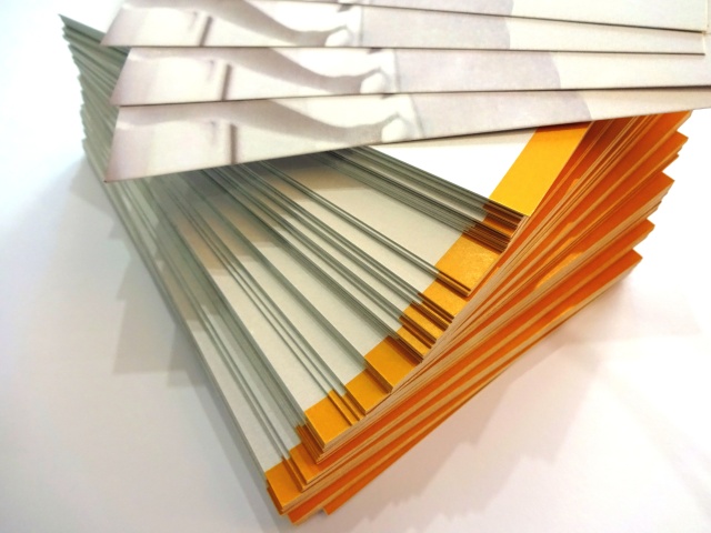
Low weight gloss or matt coated paper is the choice for many; however for others who desire a more refined feel, perhaps a heavier weight of paper or even card would be more appropriate. If you are unsure and would like some advice, just ask.
By following the tips outlined, you will be well on your way to creating a stunning, eye catching flyers. As is always the case, if you have any questions regarding flyer design or printing, just let us know, we are here to help.
