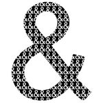
The ampersand symbol used in contemporary typography, design and writing is a glyph based on the Latin word ‘et’, which translates as ‘and’. The symbol is created by joining the letters ‘e’ and ‘t’ into what is known as a ligature.
The word ‘ampersand’ is derived from the phrase ‘et per se et and’ meaning ‘the symbol “&’ represents the word “and”‘. The symbol has stood the test of time, being assimilated into contemporary culture in design and marketing. The ‘&’ symbol is commonly used as a conjunctive in corporate identities, logos and branding. In typography and font design, the ampersand has evolved with the development of typefaces.
For example:
At Minuteman Press Bristol, we understand that using the ampersand has become a conscious design decision to shorten long names and titles to create a concise and comprehensible design.
