It is essential to get the rebranding of your business 100% correct. If you go to the expense and upheaval of a rebrand and subsequently find that it hasn’t worked, it’s often more trouble and even less successful to try to go back than it was to move on.
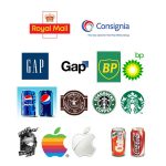
Some recent rebrands have been disastrous. When the Post Office rebranded to Consignia, customers were puzzled. What did the word ‘Consignia’ mean, for example? On seeing the word whizzing past on the side of a van, did anyone think that the business was there for delivering mail? On the other hand, ‘Post Office’ immediately said what they were about – and in this case they were about £2 million pounds poorer after the name change.
Of course, it may be easier to get the name and image right in the first place, but sometimes the business changes direction and so the original concept design no longer fits the bill. In this case, it’s important to look at all the registered names of companies already out there before spending too much money: your new name needs to be different enough from all the others to stand out, but not difficult to pronounce, spell and if telesales is a large part of what you do, it needs to be clear over a bad line. Nothing annoys a potential client or contact more than someone yelling an indecipherable word at them over the phone.
Logos must be crisp and easily recognisable. If it is excessively artistic and complex, it will not communicate the concept. If in the future you are thinking of television advertising, consider how it will appear animated, eg the Direct Line telephone, or a cute furry animal for an insurance company. You know who I mean: who would have ever thought that Aleksandr Meerkat would become so famous?!


